
Packaging Design / Visual Identity
Almost Too Good to be True, but It's Not Magic Cola
THE MISSION
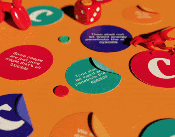
It's Not Magic Cola was a brand idea that aimed to expose society's hidden realities and shock its viewers with satirical truths. It hoped to reflect on hardships amid the pandemic and bring insight to its mysteries. We played on the idea of something being supposedly magical—revered, even—only to find that it was natural all the while.
It's Not Magic Cola was a brand idea that aimed to expose society's hidden realities and shock its viewers with satirical truths. It hoped to reflect on hardships amid the pandemic and bring insight to its mysteries. We played on the idea of something being supposedly magical—revered, even—only to find that it was natural all the while.
THE OUTCOME
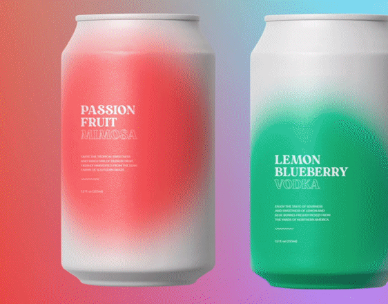
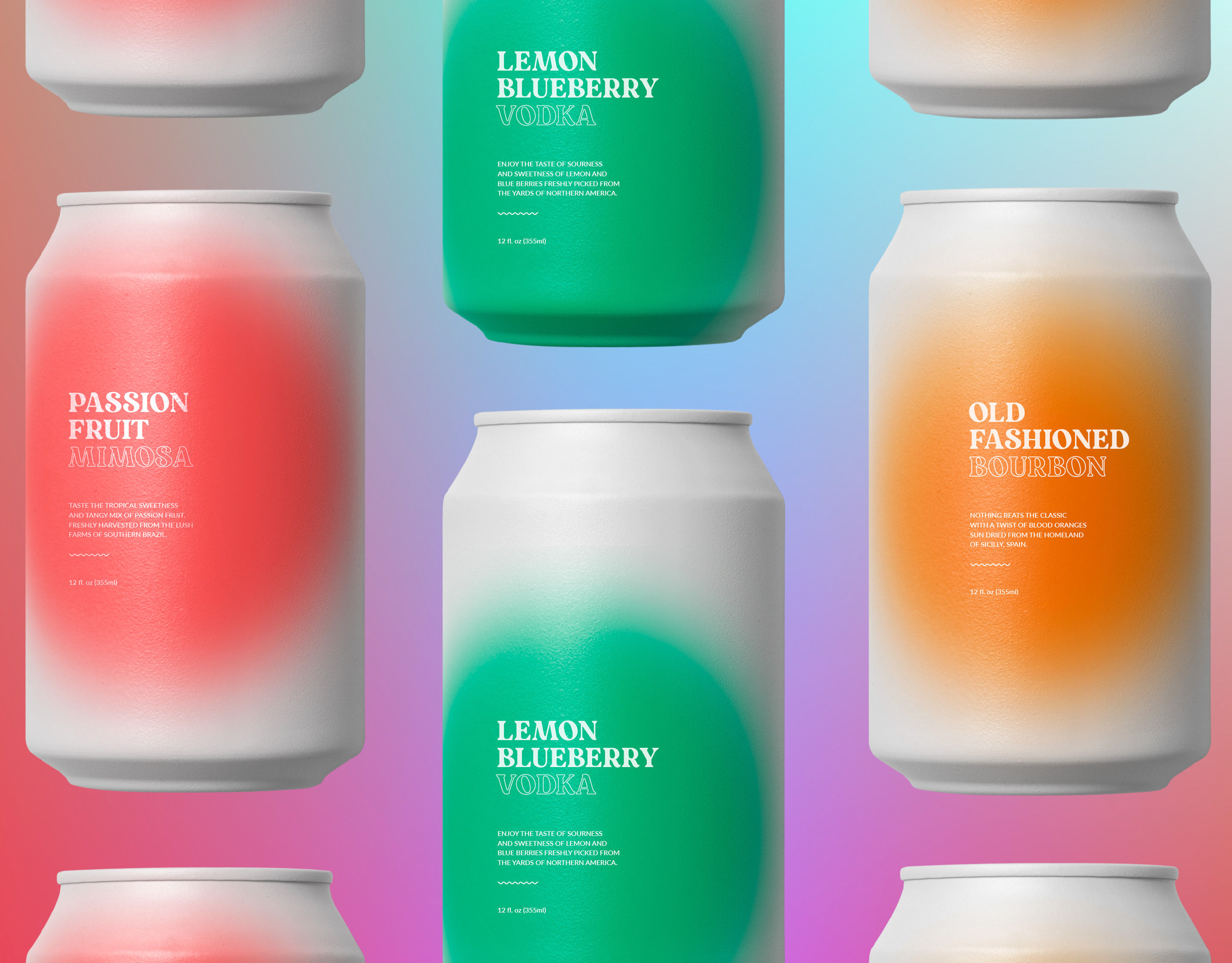
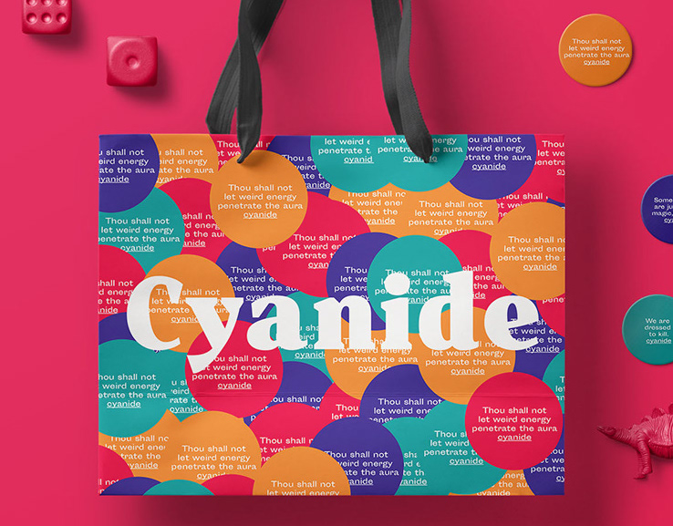
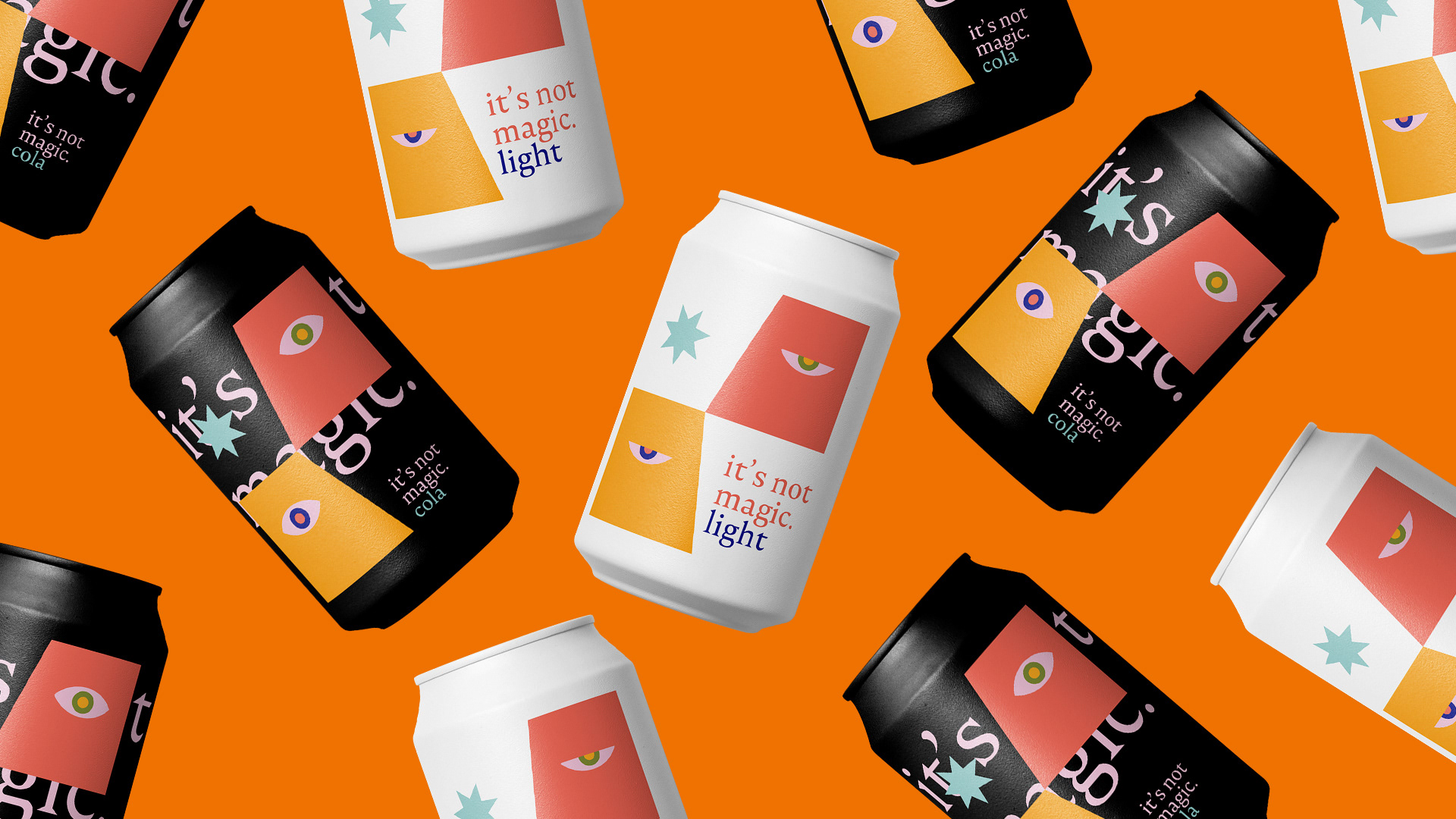
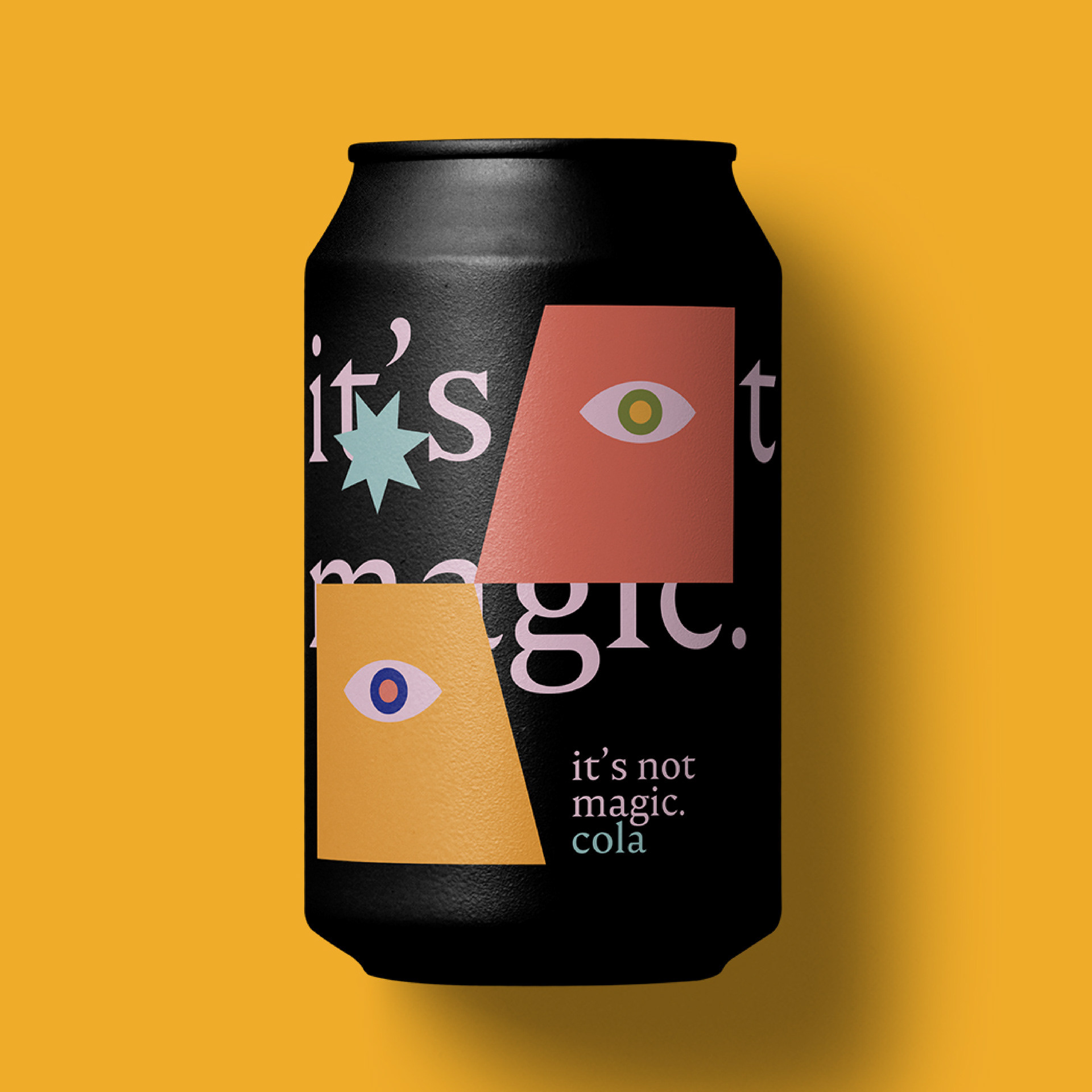
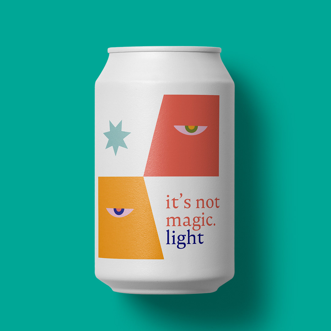
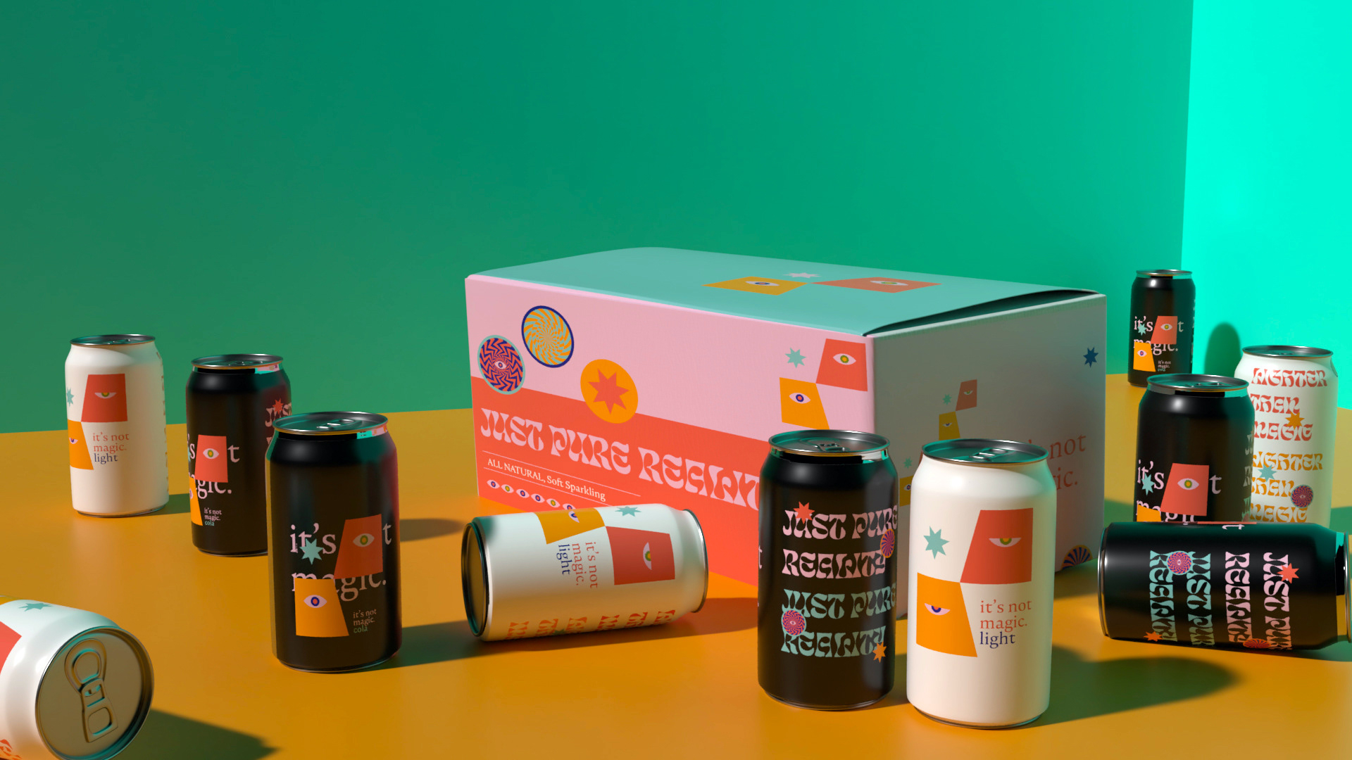
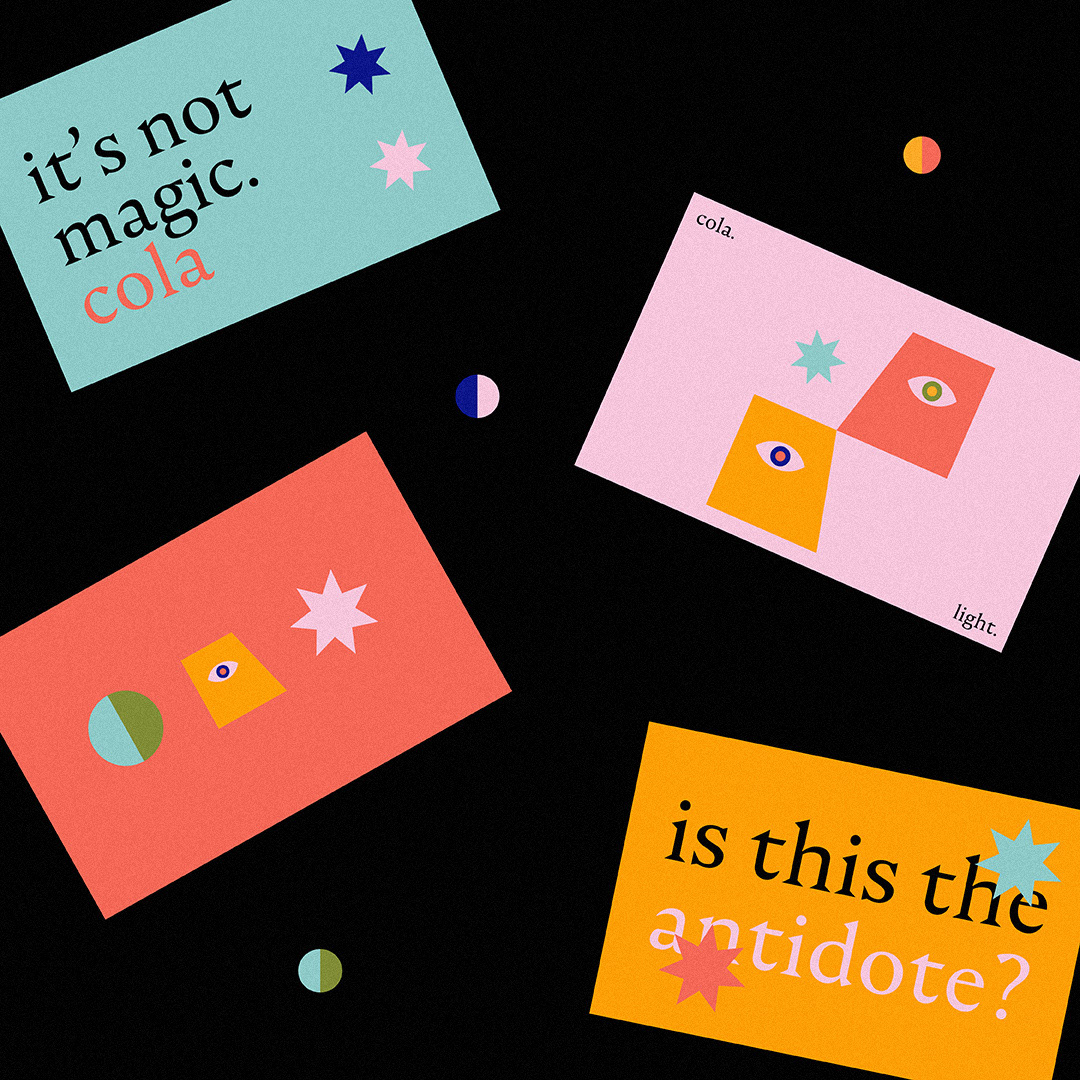
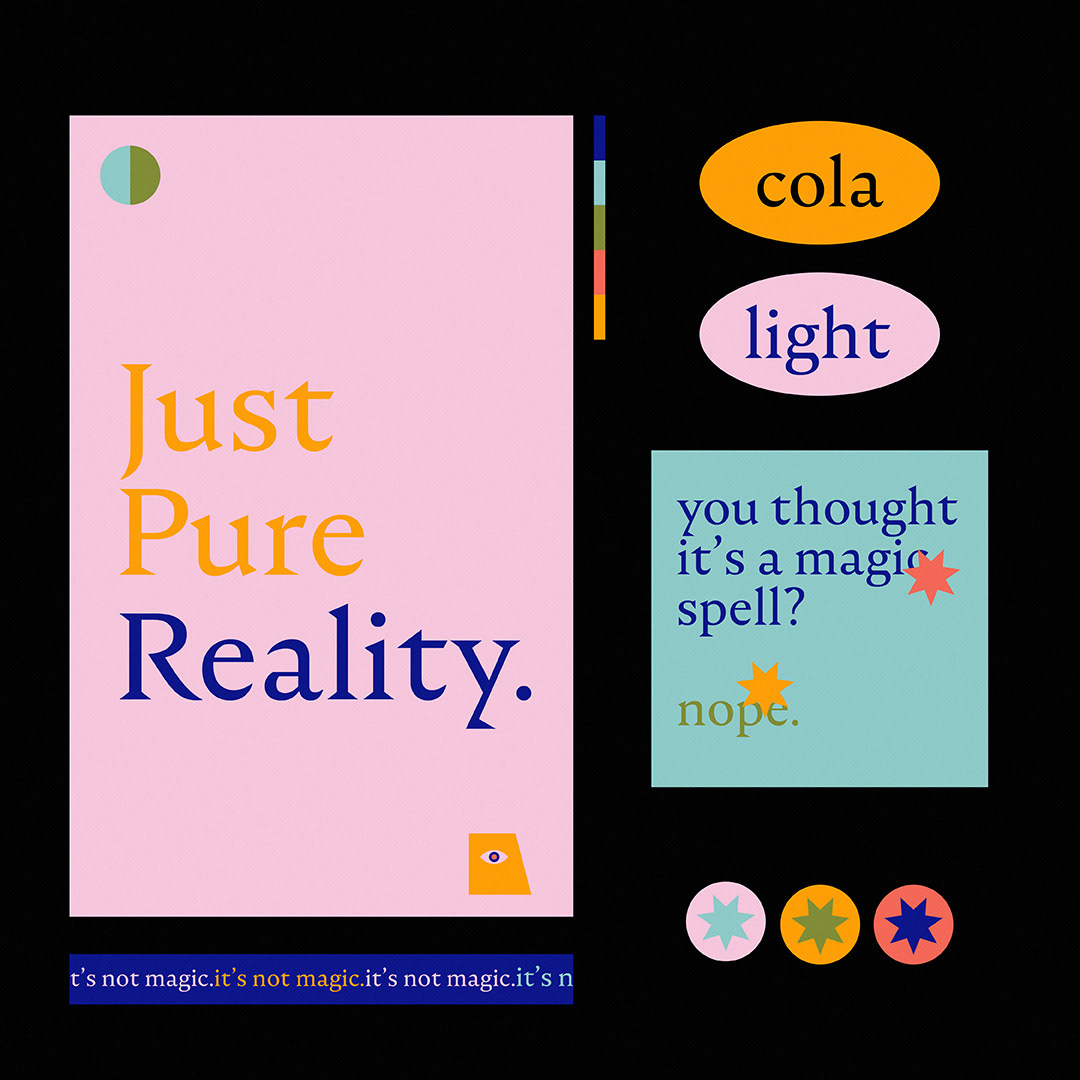
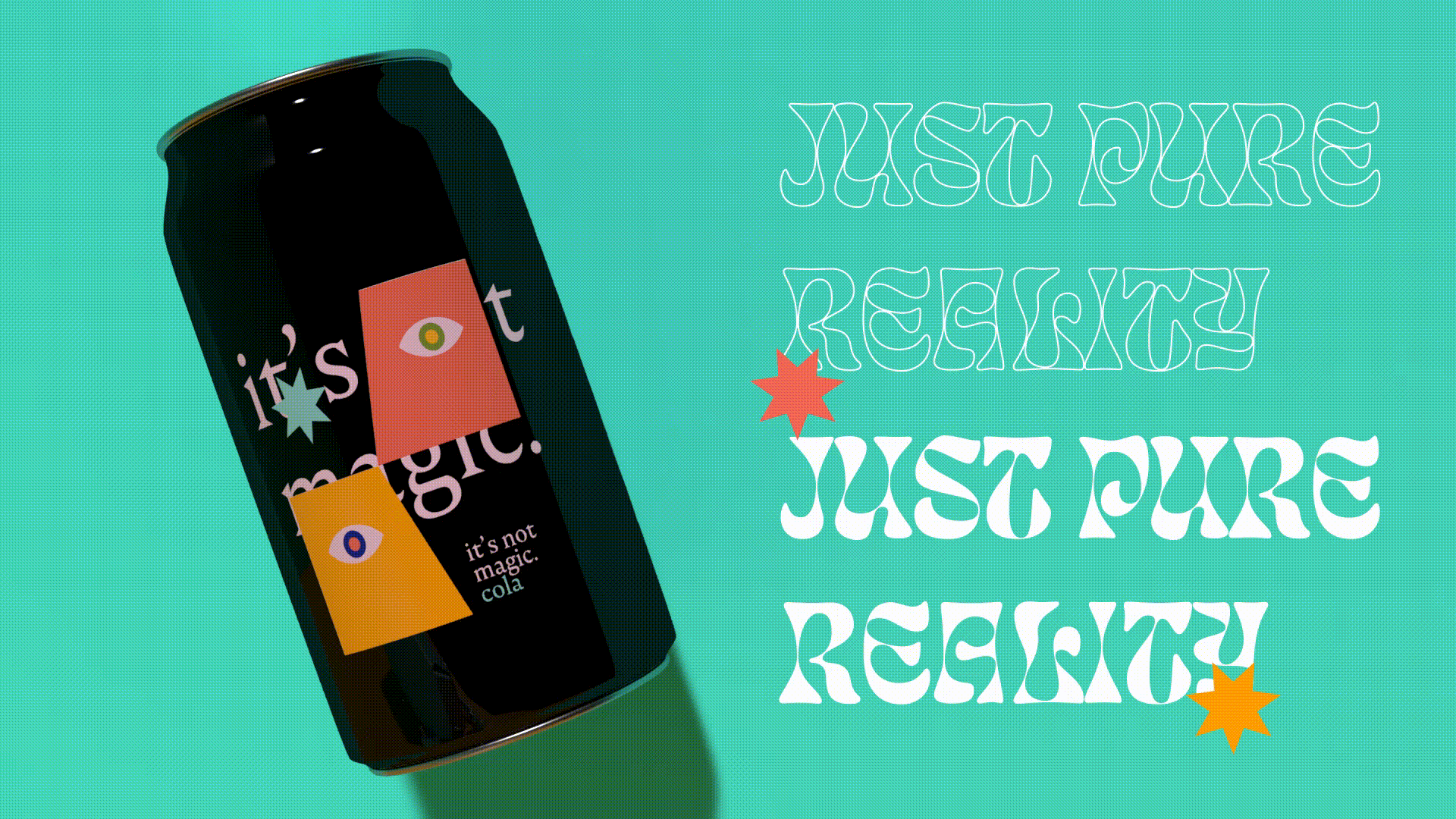
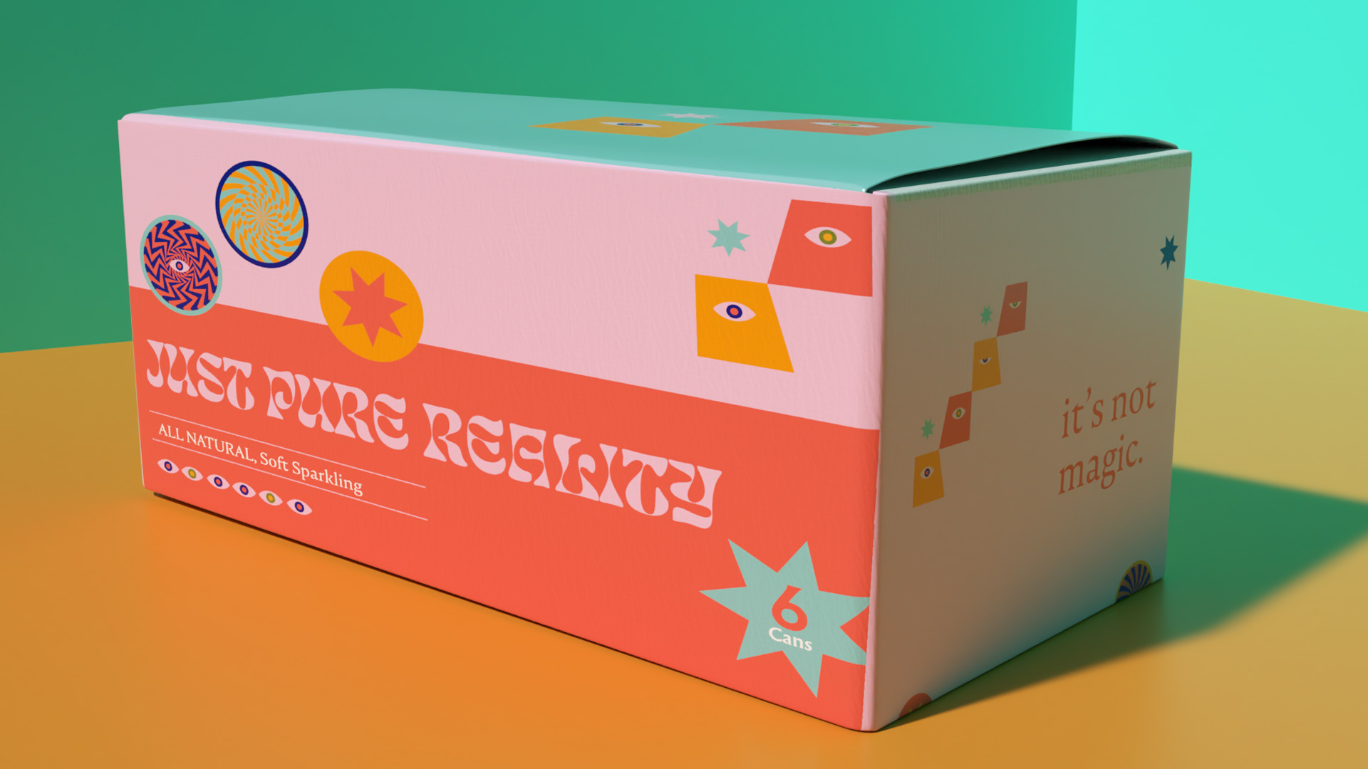
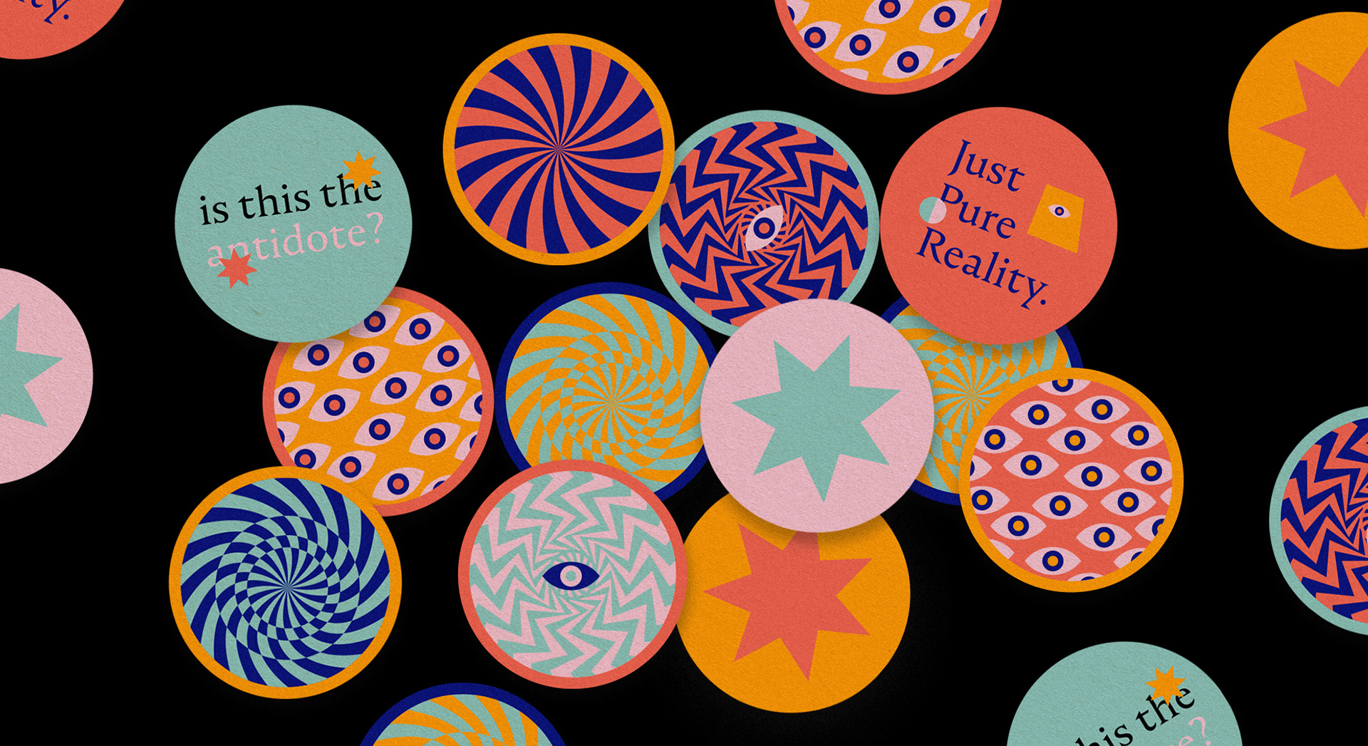
Inspired by the contradicting notions of magic and reality, we came up with design elements that reflected both concepts. We incorporated a spark symbol to represent magic spells and eyes to represent the truth and reality. We created a balance between luxury and fun, playing around with monochromatic color schemes with hints of vibrant hues.
Inspired by the contradicting notions of magic and reality, we came up with design elements that reflected both concepts. We incorporated a spark symbol to represent magic spells and eyes to represent the truth and reality. We created a balance between luxury and fun, playing around with monochromatic color schemes with hints of vibrant hues.
THE IMPACT
It's Not Magic Cola has tremendous potential for pitching to existing soda manufacturers and beverage companies. It opens up possibilities for guilt-free soda—all-natural, like we promised!
It's Not Magic Cola has tremendous potential for pitching to existing soda manufacturers and beverage companies. It opens up possibilities for guilt-free soda—all-natural, like we promised!
Type
Conceptual Project
Discipline
Packaging Design
Sector
Food & Beverage
Conceptual Project
Discipline
Packaging Design
Sector
Food & Beverage