
Rebranding / Visual Identity System
Pocketbean Cafe | Feel Most at Home Through Simple Snacks & Coffee.
ABOUT THE BRAND
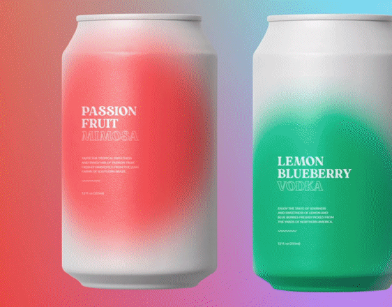
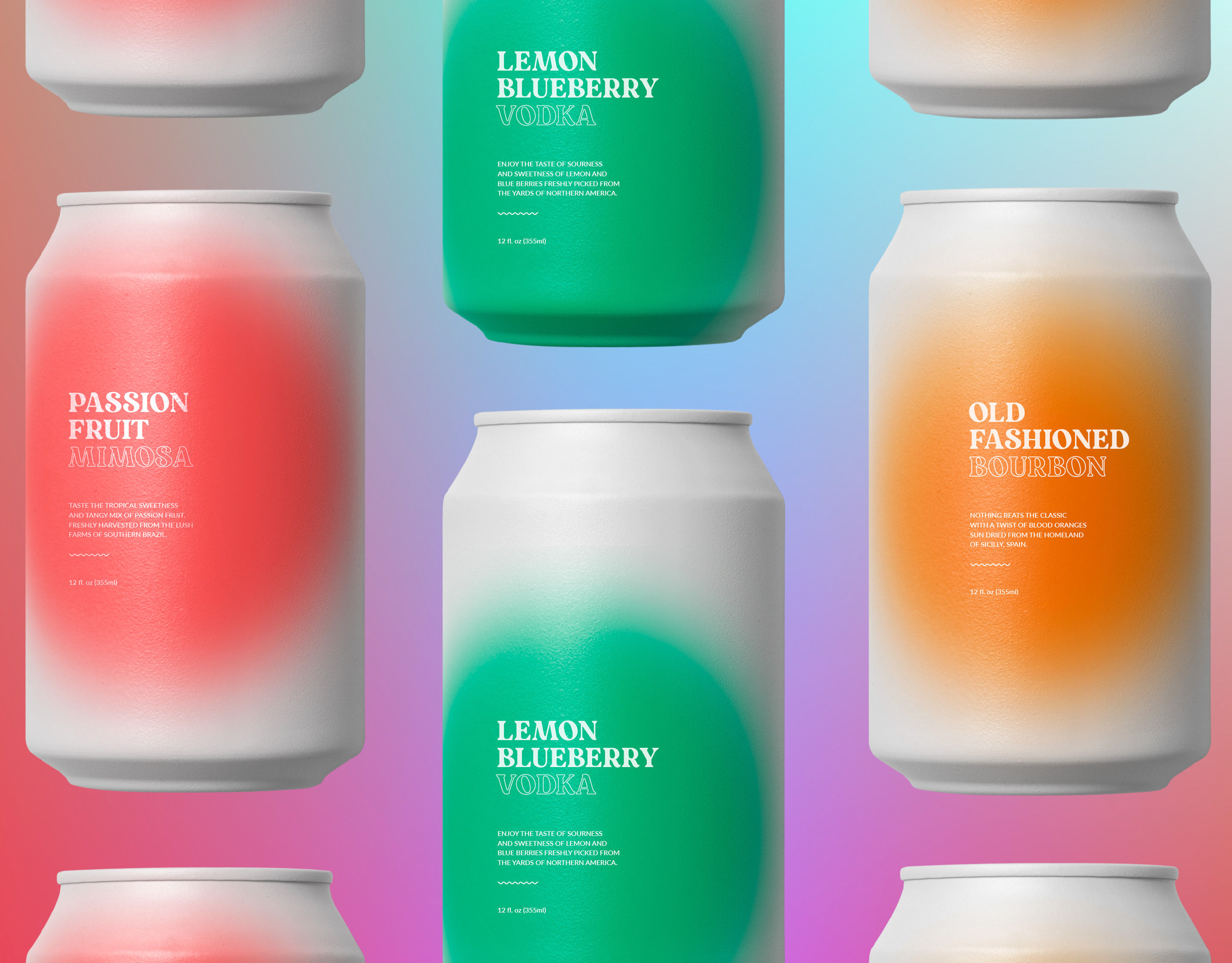
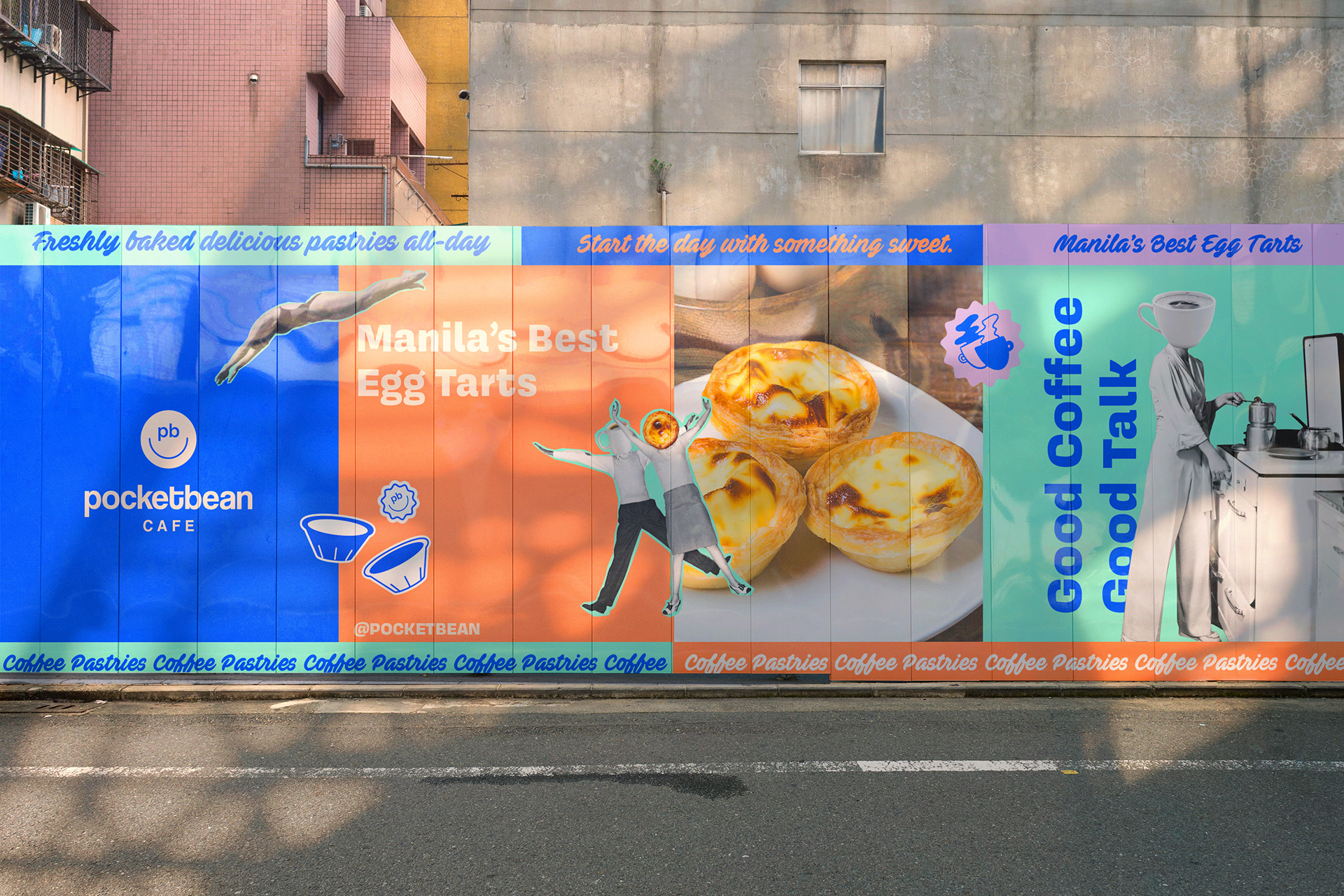
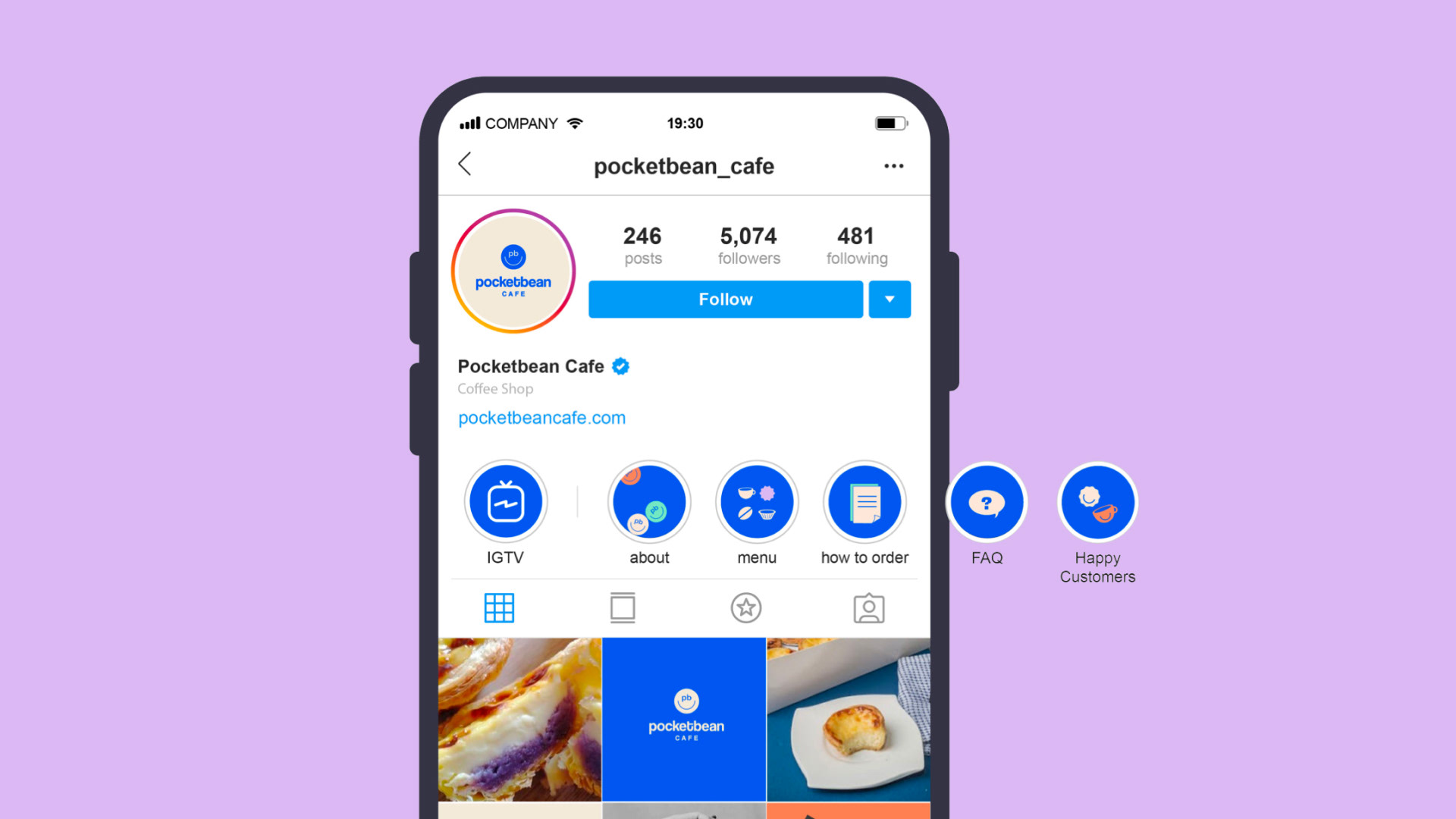
Pocketbean Cafe, a local pastry pop up shop that first opened its doors to customers in 2017, bore the brunt of the pandemic in 2020 and was forced to take its operations online. Now ready for a rebranding opportunity, we aimed to create a new visual identity that was younger, more vibrant, and relatable.
THE CHALLENGE
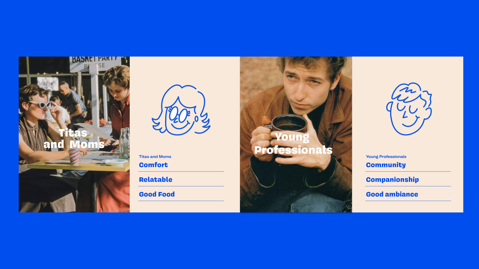
To bridge the gap between older and the younger audience, we developed two main profiles as part of the strategy for Pocketbean Cafe—Tita Imelda, a 60-year-old mother who values simple comforts and good conversations. The second is Anton, an aspiring customer based on millennial professionals and coffee enthusiasts.
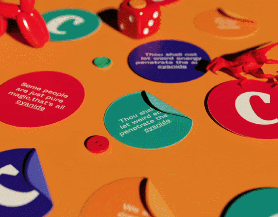
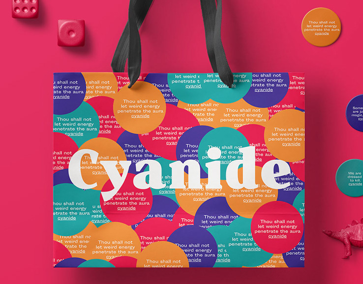
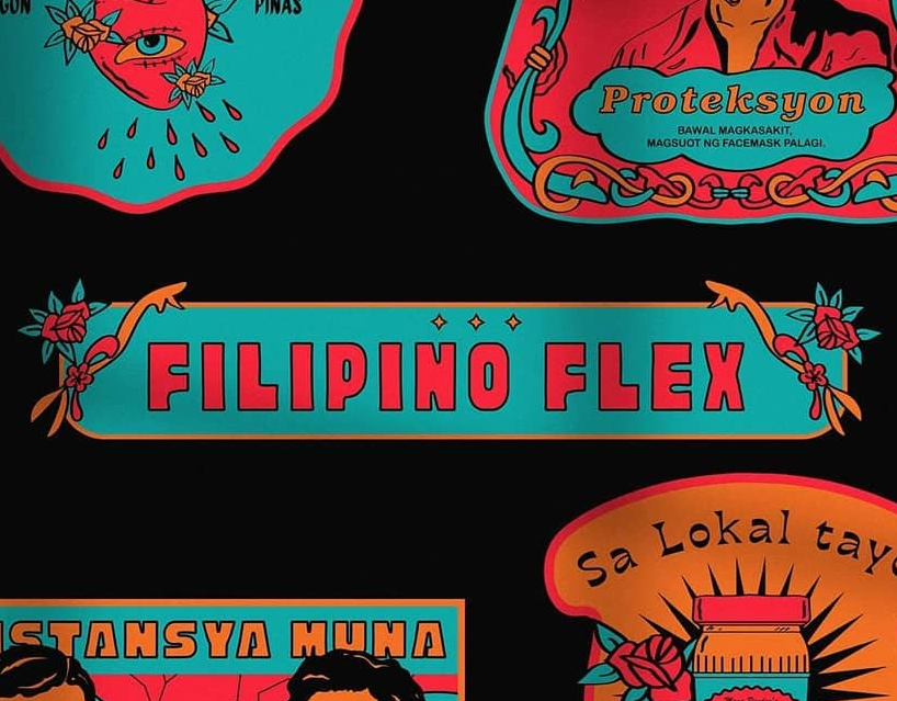
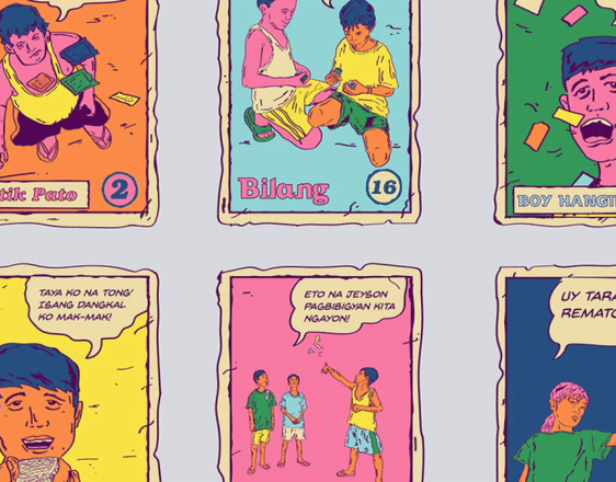
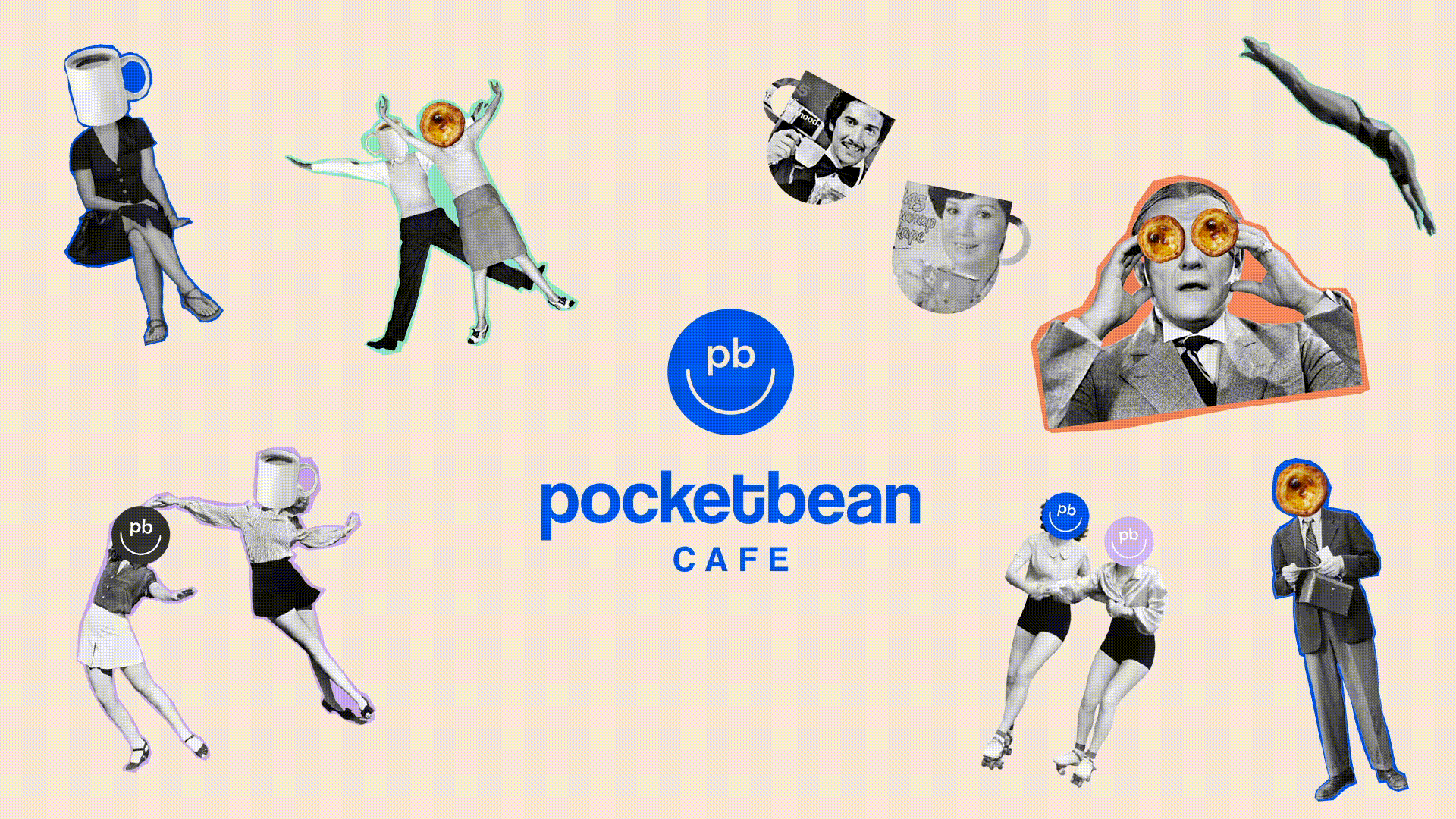
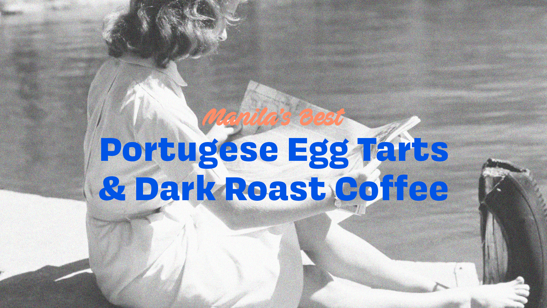
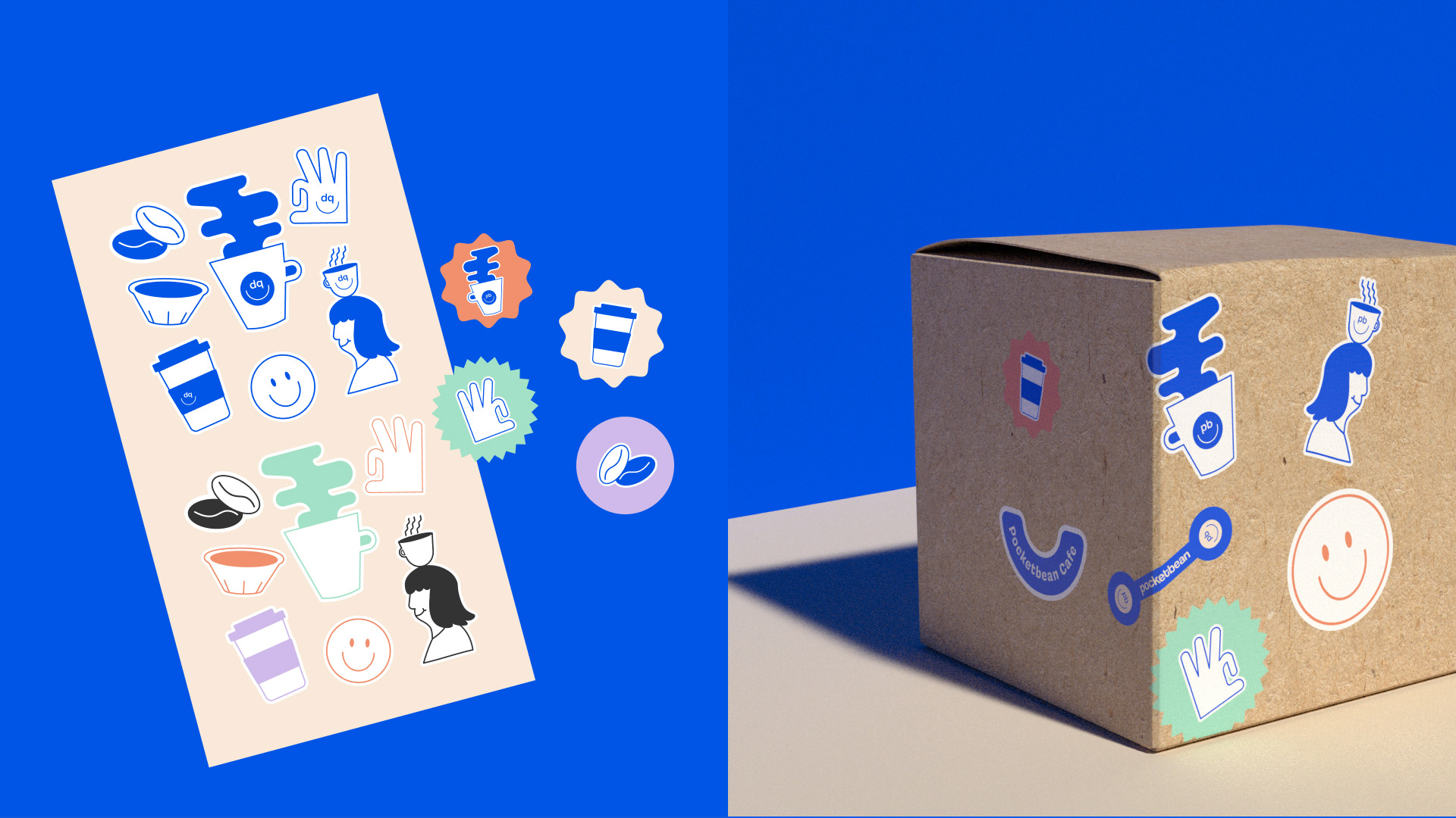
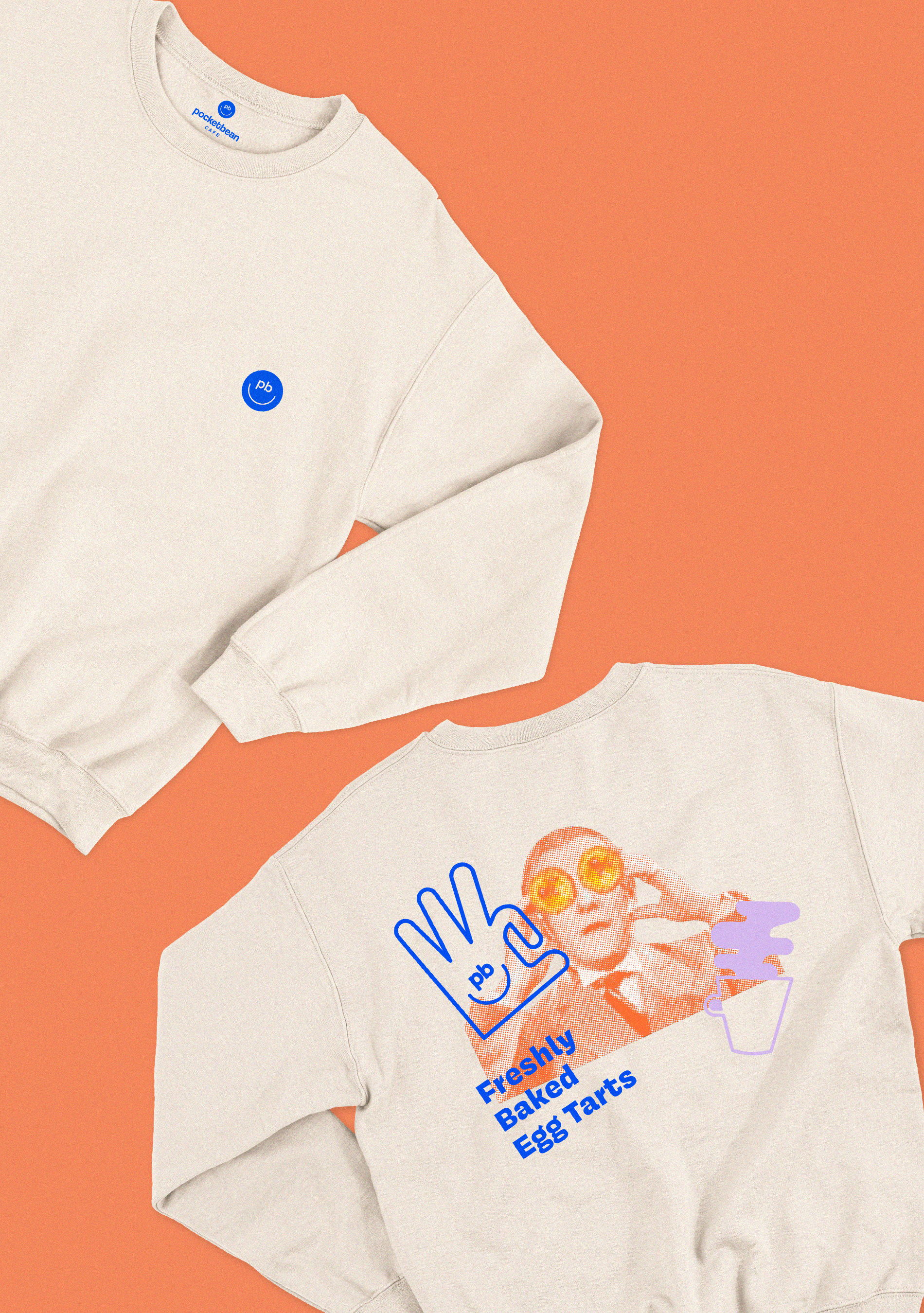
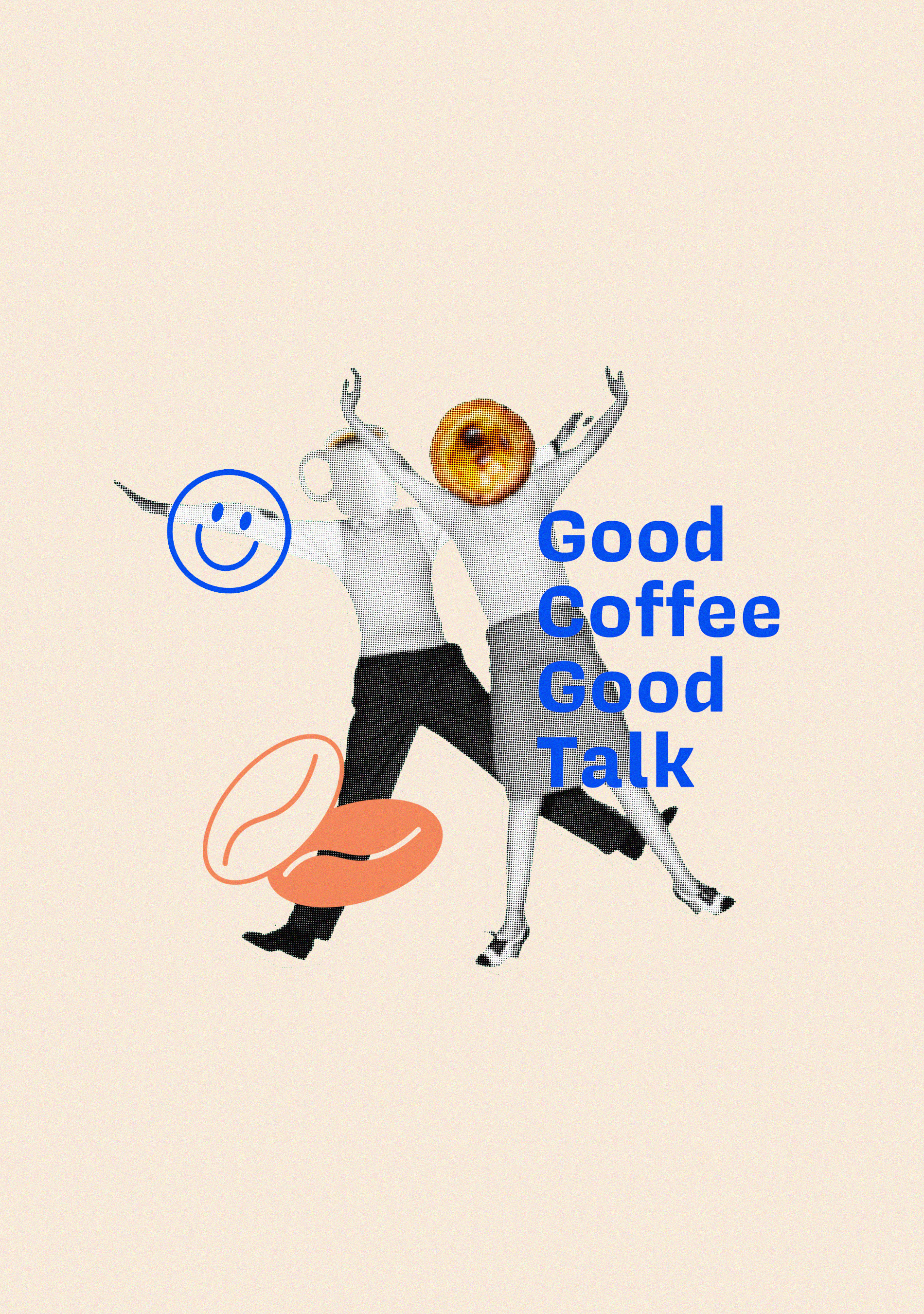
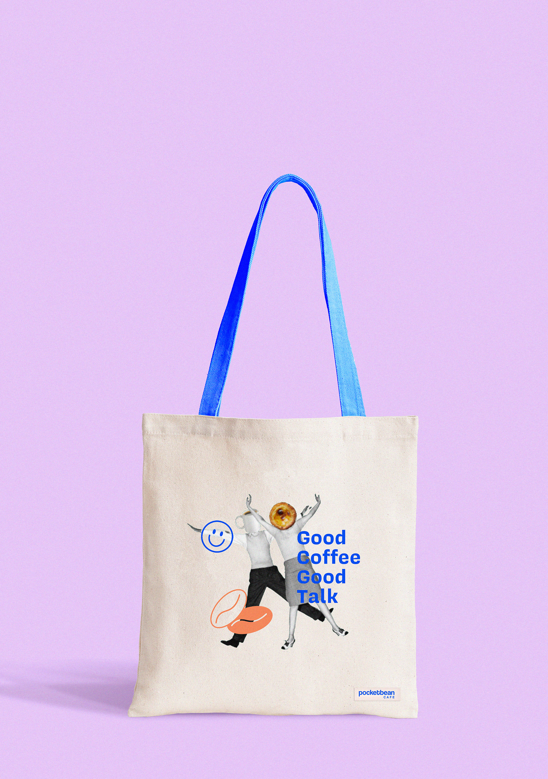
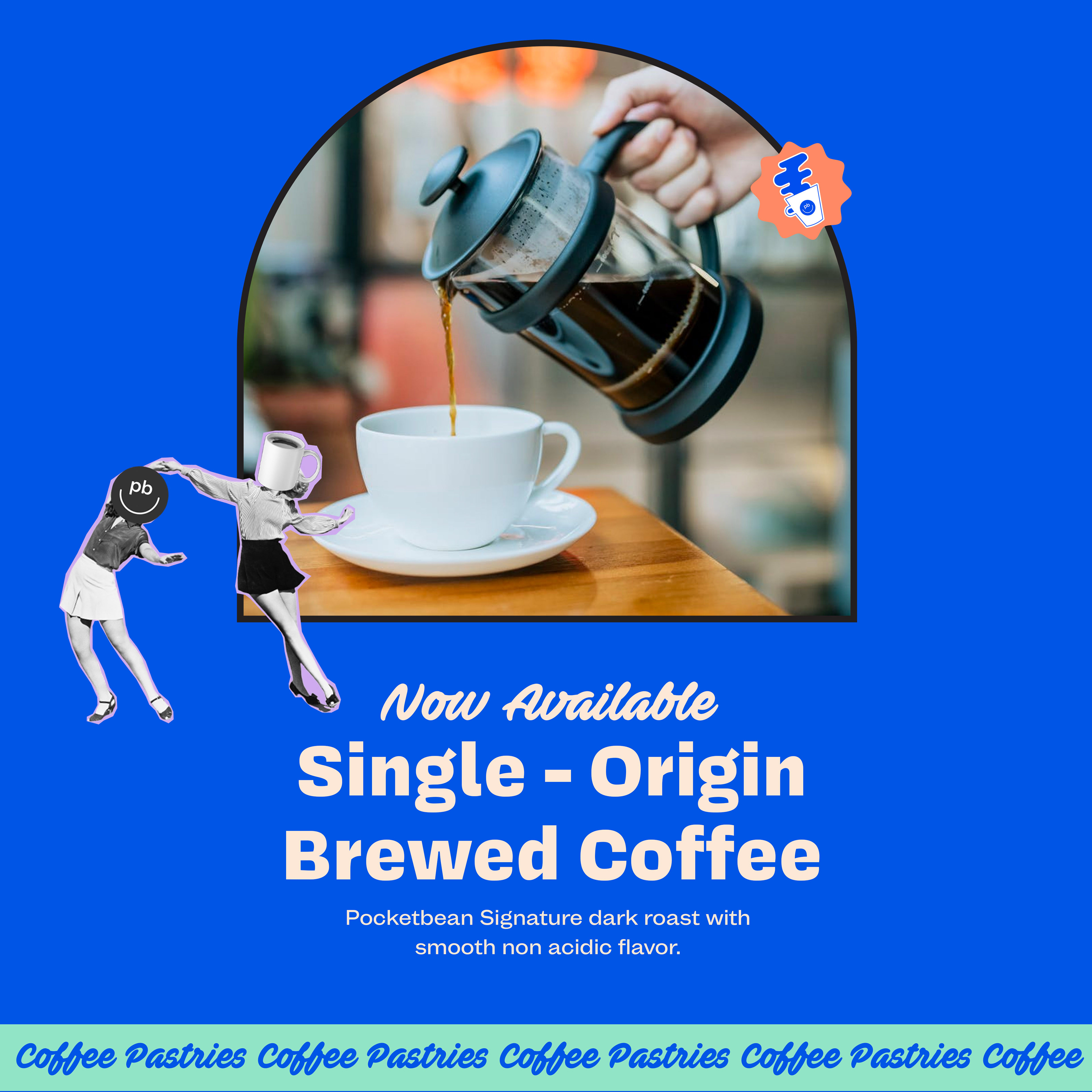
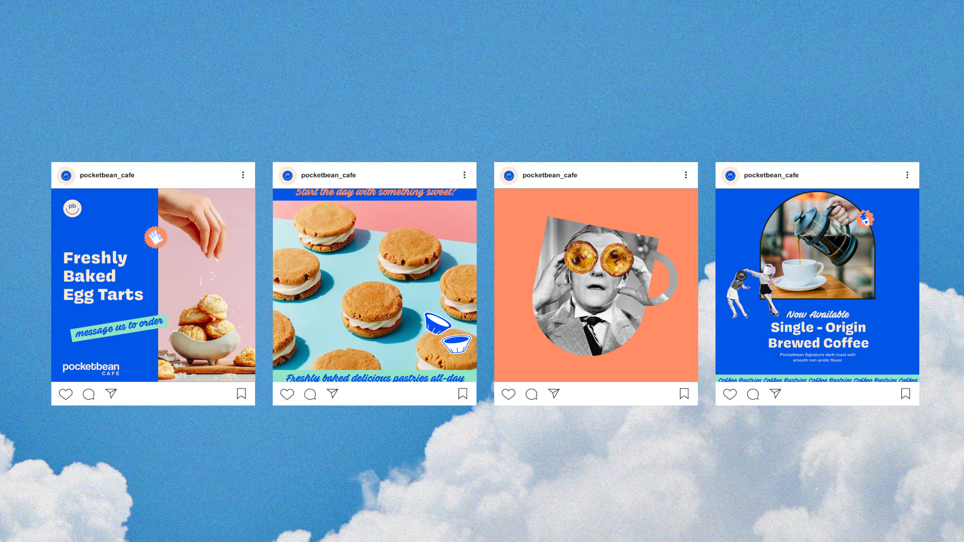
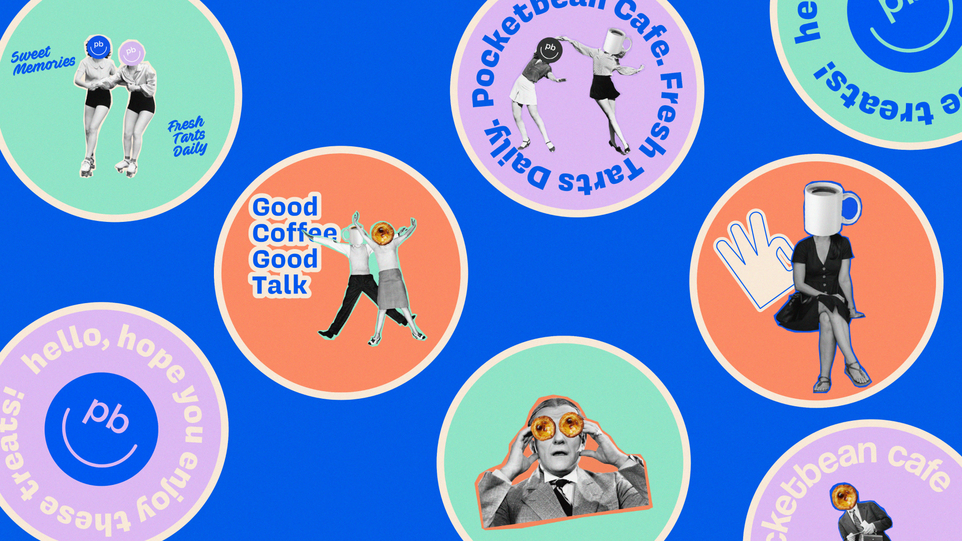
Through brand profiling, we were able to develop a creative concept for Pocketbean Cafe, incorporating nostalgic visual elements like vintage cut-outs, classic photographs, line art illustrations, and welcoming colors.
Through brand profiling, we were able to develop a creative concept for Pocketbean Cafe, incorporating nostalgic visual elements like vintage cut-outs, classic photographs, line art illustrations, and welcoming colors.

BEHIND THE LOGO
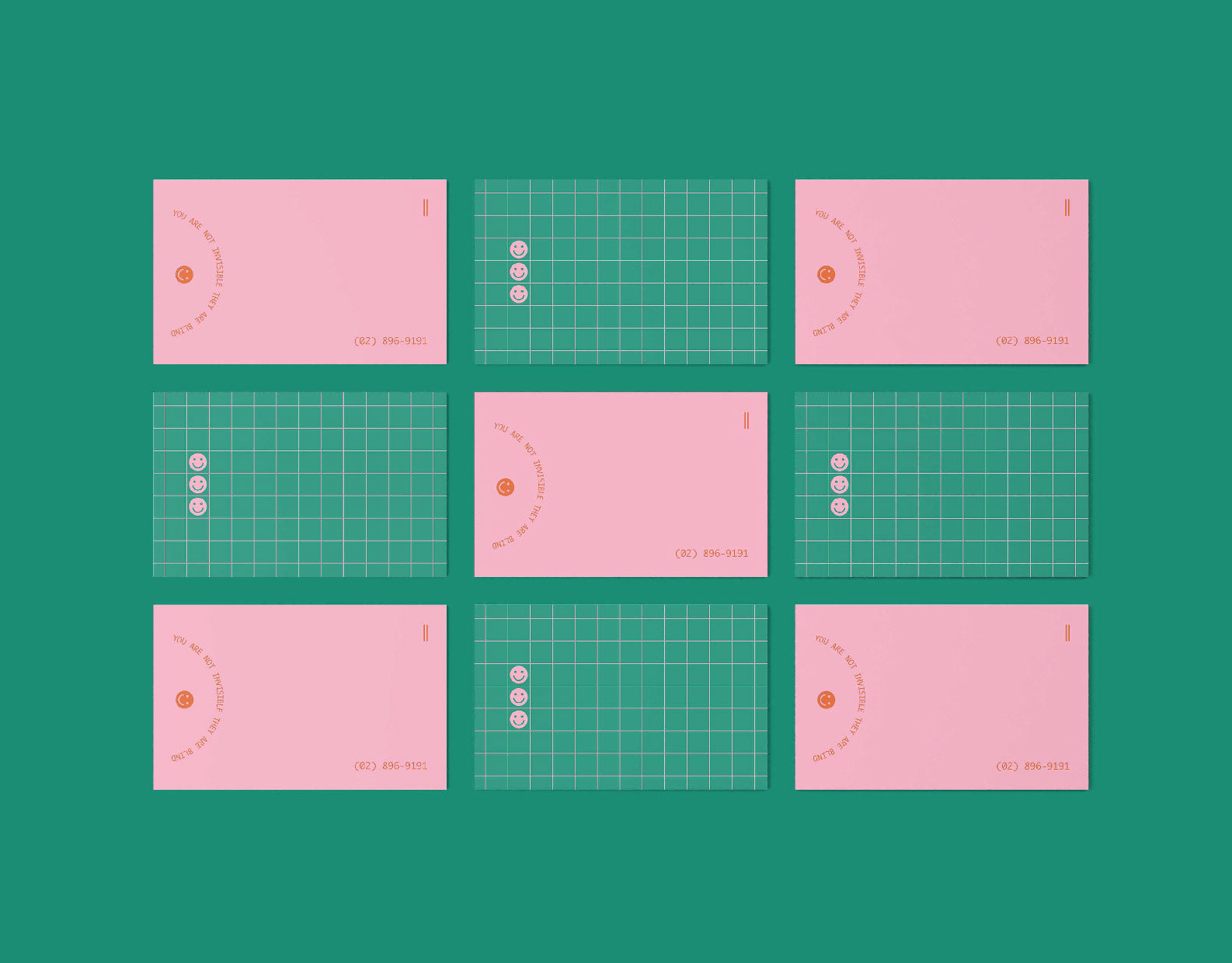
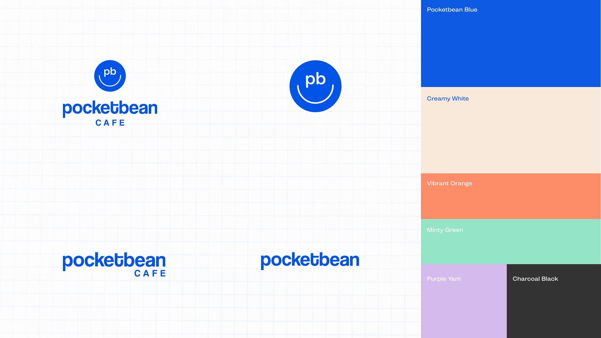
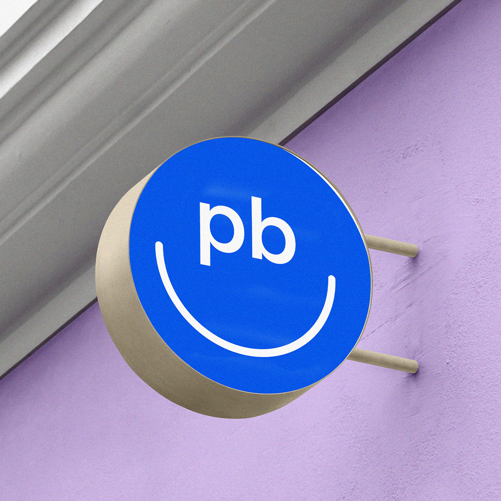
We designed a logomark that is straightforward and simple, something that would spark a connection and familiarity between the old and the new generation.
This smiley inspired logo, or should we say, "The Pocketbean Smile", speaks volume to every generation but with one simple thought—it conveys nostalgia and happiness.
Pocketbean's vision was always to bring people together through their simple and comforting snacks thus having a logo as simple and recognizable as this, instantly clicks with the brand's outlook.
THE OUTCOME
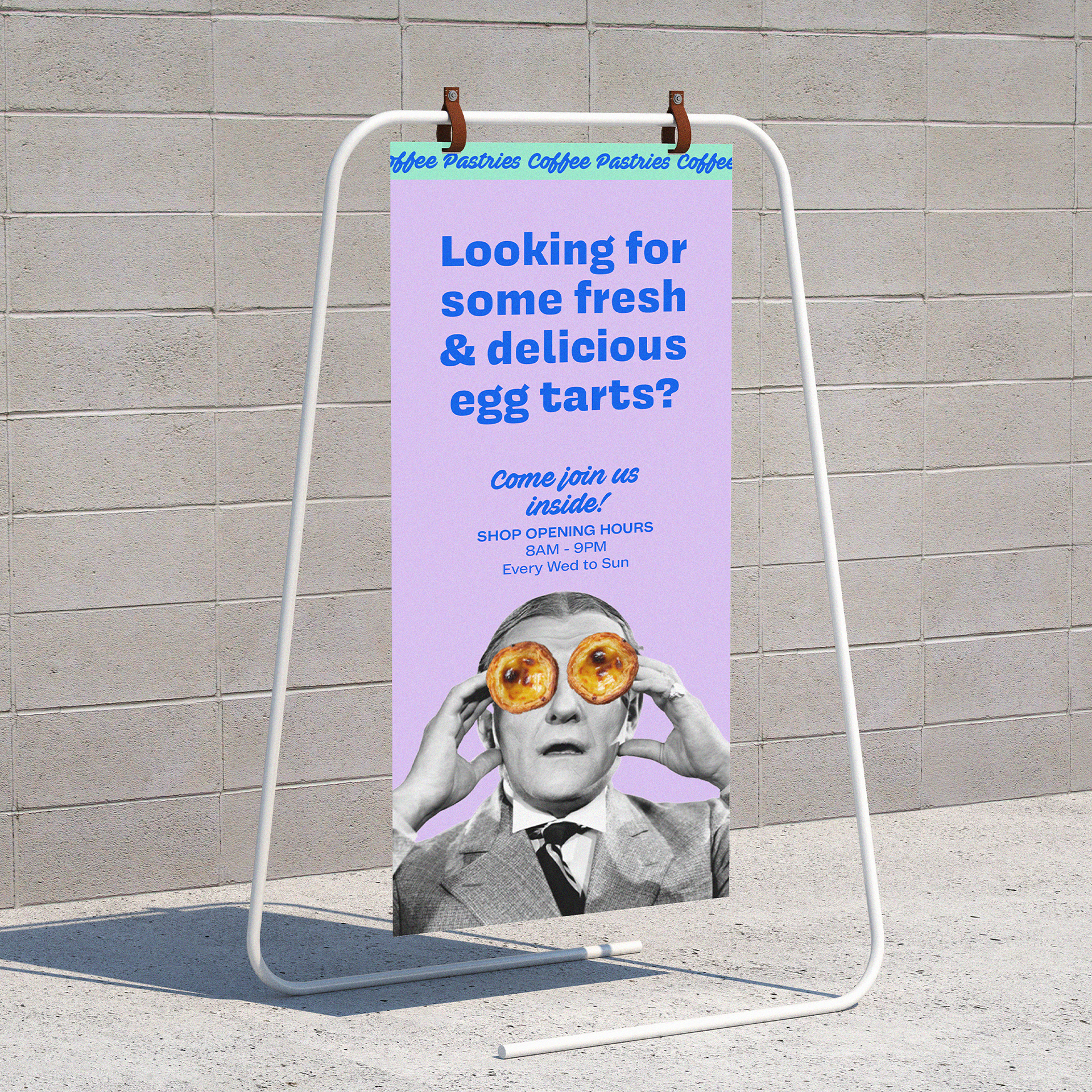
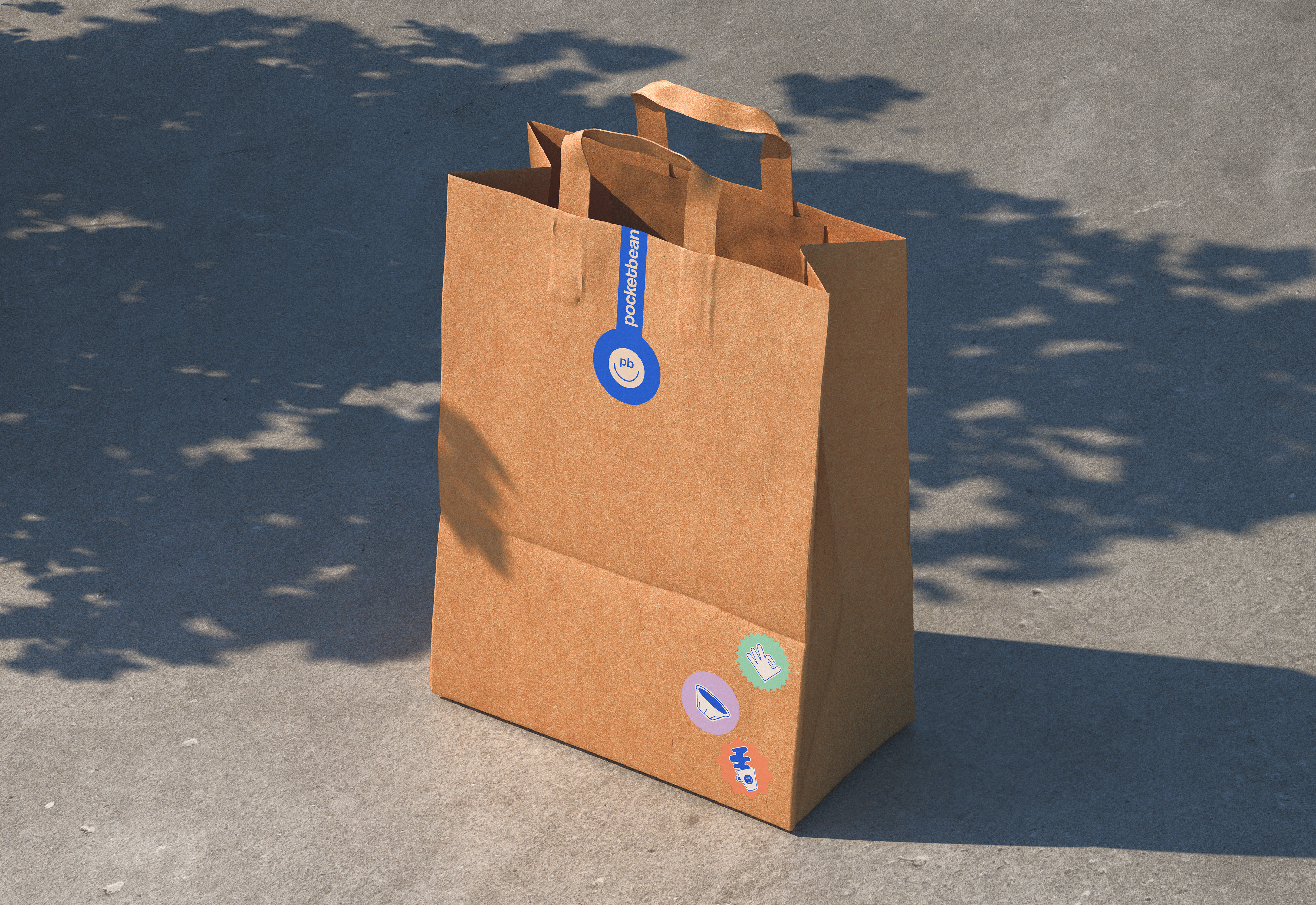
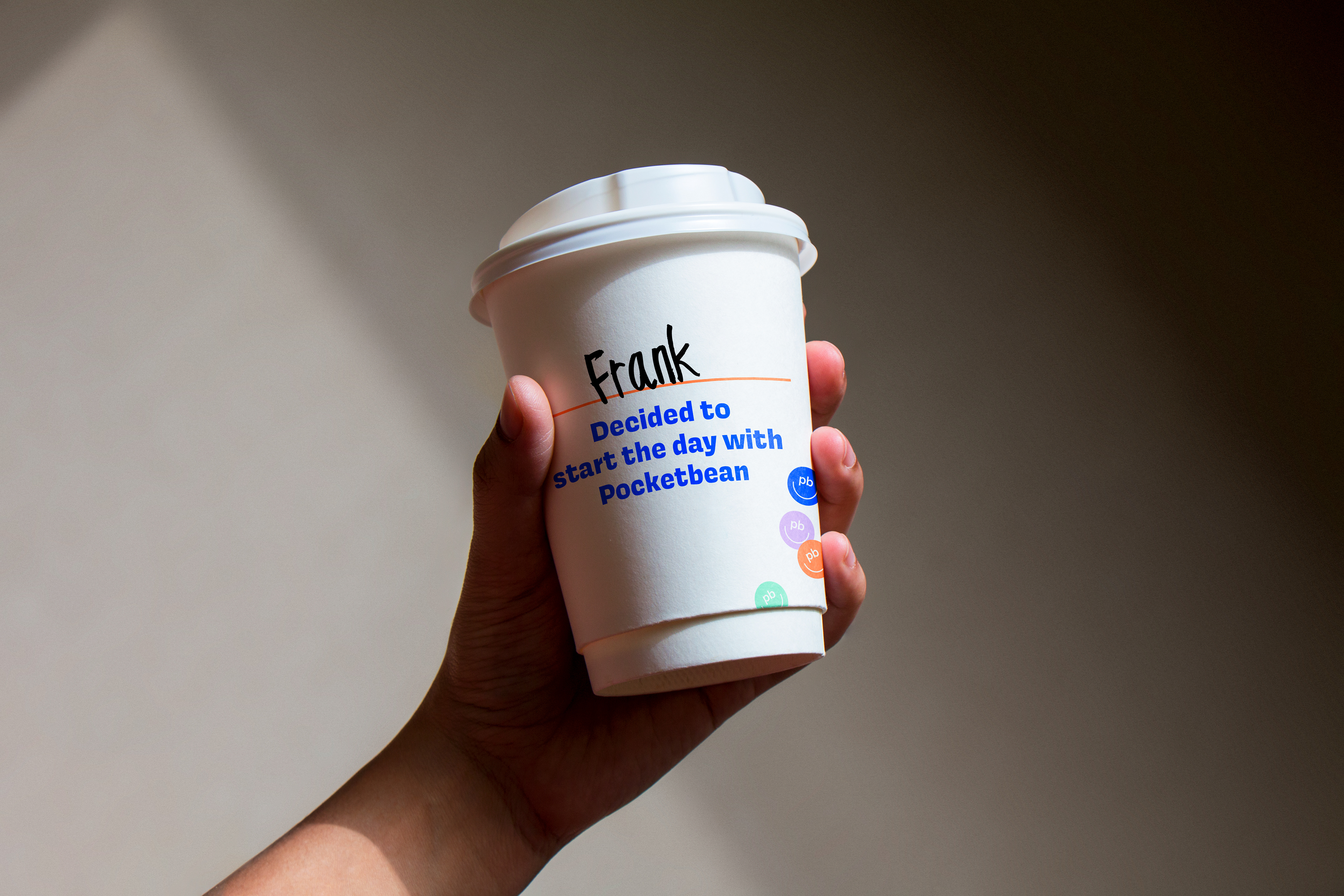
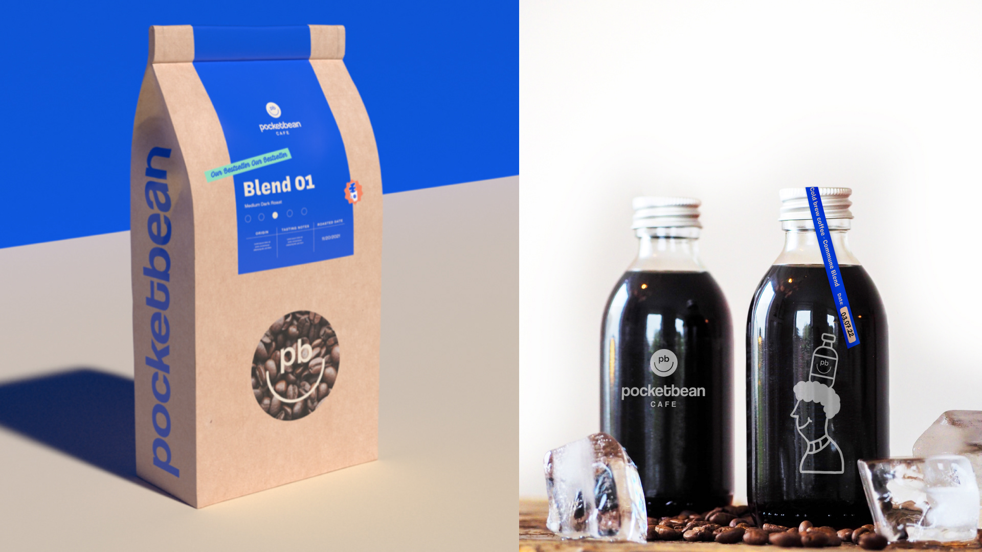
The final output was a deliberate and developed brand with a visual identity that married the Pocketbean's warm and welcoming personality through our vibrant and gutsy signature style.


Team
Brand Identity / Creative Direction -
Jelina Santos & Jethro Olba
Brand Identity / Creative Direction -
Jelina Santos & Jethro Olba